PTL Roletta is only available from www.primetype.com
Download PTL Roletta PDF Specimen Book
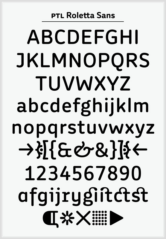
PTL Roletta is an extensive round family consisting of a sans and a slab variant, combining functionality and playfulness.
PTL Roletta Sans consists of 10 OpenType fonts with many features. The family comprises 5 weights, from regular over medium, bold and extrabold to black. Each weight comes with true italics, small caps, non-lining, lining and tabular figures as well as fractures, arrows, ligatures and mathematical signs and geometrics symbols.
PTL Roletta was originally conceived as corporate type during a pitch for the Rundfunk Berlin Brandenburg under the art direction of Uta Kopp in 2003 (Berlin-Brandenburg Broadcasting – public radio and television in the German federal states of Berlin and Brandenburg). The main idea of the typeface was a synthesis of contrasts, combining rectangular with round elements as well as slightly condensed capitals with slightly wide lowercase letters. The pitch was lost but I eventually continued to develop the typefcae and ultimately decided in 2005 to consequently apply only round terminals to create an entirely rounded family.
In 2007 the betaversion of PTL Roletta was chosen as main typeface for the typography special edition of Eye Nr. 64, Vol 16, summer issue (featuring an article about my work by Jan Middendorp).
In 2009 PTL Roletta Sans was chosen by my friends from Weiss-heiten as the corporate typeface for the German year in Vietnam 2010. They were commissioned by the Goethe Institute to develop the corporate design and collateral material for all accompanying events.
For this purpose I draw all the diacritical marks of the vietnamese alphabet for Roletta. I also designed the logotype for the German year in Vietnam with a new light version of Roletta.
Many thanks to Andreas Eigi Eigendorf for programming the Opentype fonts.